

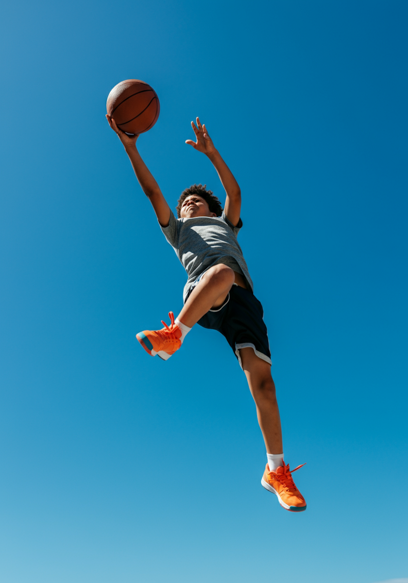
Velt
Overview
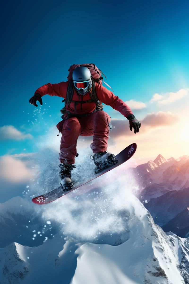
Velt is a modern smartphone company focused on thoughtful design, intuitive technology, and emotional connection. As the company prepared to launch its first flagship device, they partnered with Climb to define their brand and build a website that could introduce Velt to the market with clarity, confidence, and momentum.
The Problem
Velt was entering an intensely competitive smartphone market dominated by established global brands. While their product offered a refined user experience and strong technical performance, their early branding lacked distinction and their pre-launch website failed to communicate a clear point of view.
Key challenges included:
- No cohesive brand system or visual identity
- Messaging that focused on features instead of emotional value
- A website that felt generic and didn’t build trust or anticipation
- Low conversion rates on early waitlist signups
Velt needed a brand and digital presence that felt premium, human, and unmistakably different—without appearing inaccessible or overly technical.
The Solution
Climb partnered closely with Velt’s leadership, product, and marketing teams to reposition the company as a design-led, people-first technology brand.
Brand Strategy & Identity
Climb developed a complete brand system centered around calm confidence and everyday optimism. This included:
- A refined wordmark and logo system
- A warm, modern color palette designed to stand apart from cold, tech-heavy competitors
- A typographic system that balanced clarity with personality
- A brand voice focused on simplicity, joy, and empowerment
Website Experience
The website was designed to tell a story—moving users from curiosity to confidence to action.
- Clear, benefit-driven messaging replacing spec-heavy jargon
- Lifestyle-forward imagery showing the phone in real moments
- A modular design system for easy iteration post-launch
- Performance-optimized build for fast load times and accessibility
Every interaction was intentional, reinforcing Velt’s belief that technology should feel effortless and personal.
Project Timeline
- Week 1–2: Discovery & brand strategy workshops
- Week 3–4: Visual identity exploration and refinement
- Week 5–6: Website UX, copy, and interface design
- Week 7: Development, QA, and performance optimization
- Week 8: Launch support and analytics setup
Total timeline: 8 weeks from kickoff to launch
The Outcome
The launch positioned Velt as a credible, modern alternative in the smartphone space and exceeded internal growth benchmarks.
Results within the first 60 days:
- +212% increase in waitlist signups
- +68% improvement in homepage conversion rate
- +41% increase in average time on site
- -35% reduction in bounce rate
- Featured by multiple design and tech blogs during launch week
Most importantly, the new brand and website gave Velt a scalable foundation—one that could grow with future product launches, campaigns, and markets.
Closing
By aligning brand, messaging, and digital experience, Climb helped Velt launch with confidence in a crowded category—proving that clarity, craft, and restraint can be just as powerful as cutting-edge technology.
Northfall
Overview
Northfall is a premium snowboarding company born in the mountains and built for riders who value progression, craftsmanship, and respect for the terrain. As the brand prepared to move from small-batch boards to national retail and direct-to-consumer sales, they partnered with Climb to define a bold identity that could stand up in shops, on slopes, and online.
The Problem
Northfall had a strong product and loyal early following, but their brand didn’t reflect the quality or philosophy behind their boards. Years of organic growth had resulted in an inconsistent visual identity and unclear positioning.
Key challenges included:
- A logo and visual system that felt dated and generic
- No clear differentiation from mass-market snowboard brands
- Inconsistent application across boards, packaging, and apparel
- Difficulty attracting retail partners due to lack of brand clarity
Northfall needed a brand that communicated credibility, grit, and purpose—without leaning into clichés or extreme aesthetics that could limit long-term growth.
The Solution
Climb worked with Northfall to build a brand rooted in restraint, confidence, and mountain heritage—designed to feel timeless rather than trendy.
Brand Strategy & Identity
The new identity was inspired by elevation lines, winter light, and the quiet intensity of backcountry riding. Climb delivered:
- A bold, minimal wordmark designed for board tops, bindings, and apparel
- A flexible logo system that scaled from small hardware marks to retail signage
- A muted, high-contrast color palette built for snow environments
- A rugged yet refined typographic system emphasizing strength and clarity
The brand voice was sharpened to speak directly to committed riders—focusing on progression, trust, and the relationship between rider and terrain.
Project Timeline
- Week 1–2: Brand discovery, rider interviews, and competitive analysis
- Week 3–4: Identity exploration and visual system development
- Week 5: Board graphics, packaging, and apparel applications
- Week 6: Brand guidelines and launch asset delivery
Total timeline: 6 weeks from kickoff to final brand system
The Outcome
The rebrand positioned Northfall as a credible premium option in a crowded snowboarding market and unlocked new growth opportunities.
Results within the first season:
- 3× increase in wholesale inquiries
- +54% growth in direct-to-consumer sales
- Secured placement in 12 new retail locations
- Sold out flagship board model two months ahead of forecast
- Improved brand consistency across all product lines and marketing channels
Most importantly, the new identity gave Northfall a platform they could grow into—supporting future product lines, collaborations, and global expansion.
Closing
By grounding the brand in authenticity and restraint, Climb helped Northfall stand out without shouting—proving that strong branding doesn’t have to be loud to be powerful.
Lume
Overview
Lume is a modern eyewear company creating thoughtfully designed glasses that balance style, comfort, and everyday wearability. As the founders prepared to launch their first collection direct-to-consumer, they partnered with Climb to build a brand that felt elevated yet approachable—designed to live comfortably at the intersection of fashion and function.
The Problem
Lume entered a crowded eyewear market where many brands looked and sounded the same. While their frames were well-designed and affordably priced, their early identity didn’t clearly communicate what made Lume different—or who it was for.
Key challenges included:
- An undeveloped brand identity with no clear point of view
- Messaging that leaned generic and price-focused
- Inconsistent visual direction across packaging, social, and retail assets
- Difficulty building trust as a new, online-only eyewear brand
Lume needed a brand that felt confident, stylish, and human—without the exclusivity or clinical tone common in the category.
The Solution
Climb worked with Lume to create a brand centered on clarity—both literally and emotionally—positioning the company as a daily essential rather than a fashion trend.
Brand Strategy & Identity
The identity system was inspired by light, balance, and simplicity. Climb delivered:
- A clean, modern wordmark designed to feel timeless across seasons
- A soft, neutral color palette paired with subtle accent tones
- A typographic system combining editorial elegance with everyday legibility
- A flexible design system adaptable to digital, packaging, and in-store displays
The brand voice focused on confidence without pretense—highlighting comfort, craftsmanship, and self-expression rather than luxury signaling.
Project Timeline
- Week 1: Brand strategy, audience definition, and positioning
- Week 2–3: Visual identity exploration and refinement
- Week 4: Packaging, frame engraving, and marketing applications
- Week 5: Brand guidelines and launch-ready asset delivery
Total timeline: 5 weeks from kickoff to final brand system
The Outcome
The new brand helped Lume launch with clarity and momentum—earning early traction and building trust with first-time customers.
Results within the first 90 days:
- +176% increase in conversion rate compared to pre-launch tests
- +63% growth in average order value
- +48% repeat purchase rate on second-frame orders
- Strong early engagement across social and email campaigns
- Positive press coverage from lifestyle and design publications
Most importantly, the brand gave Lume a scalable foundation—supporting future frame releases, collaborations, and physical retail expansion.
Closing
By focusing on restraint, warmth, and everyday confidence, Climb helped Lume cut through a saturated market—proving that the most effective brands often say less, more clearly.
Alder & Stone
Overview
Alder & Stone is a custom home builder specializing in thoughtfully designed residences that balance craftsmanship, functionality, and long-term livability. As the company expanded into higher-end custom projects, they partnered with Climb to redesign their website—creating a digital experience that could clearly communicate quality, process, and trust to prospective homeowners.
The Problem
Alder & Stone built exceptional homes, but their website didn’t reflect the level of care or detail that went into their work. The existing site relied heavily on generic imagery and lacked the structure needed to guide potential clients through a complex, high-investment decision.
Key challenges included:
- A website that focused on finished homes without explaining the building process
- Difficulty differentiating from other local custom builders
- Low engagement from qualified leads despite steady traffic
- No clear path for educating and converting serious inquiries
Alder & Stone needed a website that could act as both a portfolio and a sales tool—one that built confidence before the first conversation.
The Solution
Climb redesigned the website around clarity, transparency, and storytelling—helping prospective clients understand not just what Alder & Stone builds, but how and why.
Website Experience
The new site was designed to guide users through the full journey of working with a custom builder:
- Clear process-driven navigation explaining each phase of the build
- Elevated project photography supported by concise, human-focused copy
- Dedicated sections addressing common client questions and concerns
- A modular content system allowing easy updates as new projects are completed
The experience was intentionally calm and structured—mirroring the way Alder & Stone manages complex projects.
Project Timeline
- Week 1: Discovery, client interviews, and website strategy
- Week 2: Information architecture and wireframes
- Week 3–4: Visual design and content development
- Week 5: Web development, QA, and performance optimization
- Week 6: Launch and analytics setup
Total timeline: 6 weeks from kickoff to launch
The Outcome
The new website helped Alder & Stone attract more informed, qualified leads and streamline their sales process.
Results within the first 90 days:
- +74% increase in qualified inquiry submissions
- +49% increase in average time on site
- -32% reduction in bounce rate
- Improved lead quality reported by the sales team
- Clearer alignment between client expectations and project scope
Most importantly, the website became a long-term asset—supporting future growth without requiring constant redesigns.
Closing
By focusing on clarity and trust, Climb helped Alder & Stone turn their website into a true extension of their building process—proving that strong digital experiences matter just as much in physical spaces.
Hearth & Rise
Overview
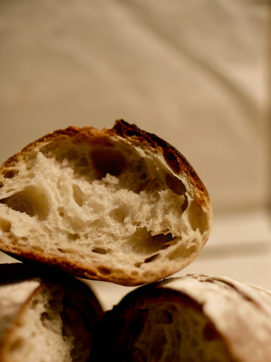
Hearth & Rise is an artisanal bread company focused on slow fermentation, simple ingredients, and everyday nourishment. As the brand prepared to expand from local farmers markets into regional grocery stores, Hearth & Rise partnered with Climb to create a brand identity that could communicate craftsmanship, approachability, and trust—both on the shelf and at the table.
The Problem
Hearth & Rise had built a loyal local following, but their brand lacked the clarity and consistency needed for broader distribution. Packaging and visuals felt homemade rather than intentional, and the brand struggled to stand out in crowded bread aisles dominated by loud claims and rustic clichés.
Key challenges included:
- An inconsistent visual identity across packaging and signage
- Difficulty communicating quality without feeling niche or pretentious
- Limited shelf impact in competitive retail environments
- A need to scale the brand while preserving its handmade roots
Hearth & Rise needed a brand that felt honest and familiar—one that invited trust at first glance.
The Solution
Climb developed a brand rooted in warmth, restraint, and everyday ritual—designed to feel timeless rather than trendy.
Brand Strategy & Identity
The identity system drew inspiration from early mornings, shared meals, and the quiet craft of baking.
- A classic yet modern wordmark designed for packaging and storefronts
- A warm, natural color palette inspired by grain, flour, and crust
- A typographic system balancing tradition with contemporary clarity
- Subtle graphic elements referencing scoring marks and fermentation patterns
The brand voice was refined to focus on nourishment, patience, and care—speaking to families and food-conscious shoppers alike.
Project Timeline
- Week 1: Brand discovery and positioning
- Week 2–3: Visual identity exploration and refinement
- Week 4: Packaging system and retail applications
- Week 5: Brand guidelines and production-ready assets
Total timeline: 5 weeks from kickoff to final brand system
The Outcome
The new brand helped Hearth & Rise successfully transition from local favorite to regional retail presence.
Results within the first 90 days:
- Secured placement in 18 regional grocery stores
- +61% increase in sell-through compared to previous packaging
- Strong positive feedback from retail buyers and customers
- Improved brand recognition across in-store and digital channels
- Clear framework for future product line extensions
Most importantly, Hearth & Rise gained a brand designed to scale—without losing the care and craft that defined it from the start.
Closing
By focusing on warmth and clarity, Climb helped Hearth & Rise build a brand that feels as trustworthy as the product itself—proving that good design, like good bread, is built slowly and with intention.

Fieldwise
Overview
Fieldwise is a modern agricultural supply company serving independent farmers with tools, equipment, and services designed for long-term productivity. As the company prepared to expand beyond regional sales into a national audience, they partnered with Climb to rebuild their website and create a marketing film that could clearly communicate their value, credibility, and commitment to the farming community.
The Problem
Fieldwise had earned trust through years of hands-on experience, but their digital presence didn’t reflect the depth or reliability of their offering. Their existing website was difficult to navigate, visually dated, and ineffective at telling their story. Marketing efforts leaned heavily on product specs, missing the human side of modern farming.
Key challenges included:
- A website that felt transactional rather than relational
- No clear narrative explaining how Fieldwise supports farmers beyond products
- Low engagement with digital marketing campaigns
- Difficulty communicating credibility to new customers outside their region
Fieldwise needed a digital experience that felt grounded, honest, and human—while still being strong enough to support growth and lead generation.
The Solution
Climb approached the project by focusing on the people behind the work. The strategy combined a clear, conversion-focused website with a cinematic marketing film rooted in real farming moments.
Website Experience
Climb redesigned the Fieldwise website to prioritize clarity, trust, and ease of use:
- Simplified navigation organized around farmer needs, not product categories
- Clear messaging focused on partnership, reliability, and long-term value
- A modular design system allowing teams to easily add products and resources
- Performance-optimized build for rural connectivity and mobile use
Marketing Film
The marketing film was shot on location, capturing early mornings, long days, and the quiet pride of working the land.
- Documentary-style visuals featuring real farmers
- Minimal narration, letting visuals and natural sound carry the story
- Messaging centered on stewardship, resilience, and generational knowledge
- Short and long-form edits for web, social, and sales presentations
Together, the website and film worked as a unified story—positioning Fieldwise as a trusted partner, not just a supplier.
Project Timeline
- Week 1–2: Discovery, messaging strategy, and film concept development
- Week 3: On-location filming and website wireframes
- Week 4–5: Website design, development, and post-production editing
- Week 6: Launch, asset rollout, and performance tracking
Total timeline: 6 weeks from kickoff to launch
The Outcome
The new website and marketing film helped Fieldwise connect more deeply with their audience and supported measurable business growth.
Results within the first 90 days:
- +92% increase in qualified inbound leads
- +57% increase in time on site
- -38% reduction in bounce rate
- Higher engagement across social and email campaigns featuring the film
- Improved sales team close rates when using the film in pitches
Most importantly, Fieldwise gained a digital foundation that honored their roots while supporting future growth.
Closing
By combining clear digital strategy with honest storytelling, Climb helped Fieldwise translate real-world trust into a modern digital presence—proving that strong marketing doesn’t have to feel manufactured to be effective.
Apex Union
Overview
Apex Union is a modern sports performance company creating apparel and training gear for athletes who train with intention. As the brand prepared to launch its first national campaign and expand direct-to-consumer sales, they partnered with Climb to rebuild their website and produce a marketing film that could capture the intensity, discipline, and community behind the brand.
The Problem
Apex Union had a strong product and growing athlete base, but their digital presence didn’t reflect the energy or credibility of the brand. Their website struggled to convert traffic, and previous marketing content focused heavily on products without capturing the emotional side of training.
Key challenges included:
- A website that felt static and product-first rather than athlete-first
- No central brand story connecting training, mindset, and community
- Low engagement with existing video content
- Difficulty standing out in a saturated sports and fitness market
Apex Union needed a digital experience and campaign that felt as powerful as the athletes who wore the brand.
The Solution
Climb approached the project by focusing on movement, rhythm, and emotional payoff—creating a cohesive experience across web and film.
Website Experience
The website was redesigned to feel dynamic, immersive, and conversion-focused:
- Motion-driven layouts inspired by training cadence and repetition
- Clear messaging centered on discipline, resilience, and progress
- Streamlined product pages designed for fast decision-making
- Performance-optimized build for high traffic during campaign launches
Marketing Film
The marketing film was built around the unseen moments of training—the early mornings, the failures, the quiet wins.
- High-contrast cinematography capturing real athletes in motion
- Rapid pacing balanced with moments of stillness and breath
- Minimal dialogue, relying on sound design and movement
- Modular cuts for paid ads, social, website headers, and events
The website and film worked together to tell a single story: performance is built, not given.
Project Timeline
- Week 1: Brand alignment, messaging, and campaign planning
- Week 2: Website structure, film concept, and shot planning
- Week 3: Athlete shoots and website design production
- Week 4–5: Development, editing, and motion integration
- Week 6: Launch, analytics setup, and campaign rollout
Total timeline: 6 weeks from kickoff to campaign launch
The Outcome
The new website and marketing film helped Apex Union elevate their brand perception and accelerate growth.
Results within the first 60 days:
- +134% increase in online revenue
- +71% increase in website conversion rate
- +46% increase in average session duration
- Strong performance across paid social campaigns
- Increased athlete sign-ups and partnership inquiries
Most importantly, Apex Union gained a digital platform that could scale with future campaigns, collections, and athlete collaborations.
Closing
By blending emotional storytelling with performance-driven design, Climb helped Apex Union turn movement into meaning—proving that the strongest sports brands are built on discipline, not hype.
Driftline
Overview
Driftline is a contemporary clothing brand built around movement, texture, and everyday versatility. Designed for people who move between work, travel, and downtime without changing who they are, Driftline partnered with Climb to launch the brand with a clear identity and a marketing film that could introduce its philosophy in a way that felt human and lived-in.
The Problem
Driftline entered a crowded apparel market where many brands relied on trends, loud visuals, or influencer-driven hype. While the product line was thoughtfully designed and well-made, the brand lacked a defined point of view and a cohesive way to tell its story.
Key challenges included:
- No established visual identity or brand system
- Difficulty articulating the brand’s purpose beyond the product
- A need to stand out without chasing fast-fashion trends
- Launch marketing that needed to build emotional connection quickly
Driftline needed a brand that felt confident, restrained, and culturally relevant—one that could grow with the customer rather than age out with trends.
The Solution
Climb focused on creating a brand rooted in subtlety, rhythm, and everyday motion—allowing the clothing to speak through context rather than spectacle.
Brand Strategy & Identity
The visual system was built to feel timeless and flexible:
- A minimalist wordmark designed to live comfortably on garments and labels
- A neutral, material-driven color palette inspired by concrete, fabric, and shadow
- A typographic system that balanced editorial sophistication with clarity
- A brand voice focused on intention, movement, and quiet confidence
Marketing Film
The marketing film captured the clothes in motion, worn in real moments rather than styled scenes.
- Natural light, handheld cinematography, and slow pacing
- Everyday environments: streets, stairwells, transit, open interiors
- Minimal narration, relying on movement and sound design
- Multiple cuts created for launch, social, and in-store displays
The film and brand worked together to communicate a simple idea: clothing should move with you, not define you.
Project Timeline
- Week 1–2: Brand discovery, positioning, and visual direction
- Week 3: Identity refinement and garment applications
- Week 4: Film planning, casting, and location scouting
- Week 5: Filming and post-production
- Week 6: Brand guidelines, asset delivery, and launch support
Total timeline: 6 weeks from kickoff to launch
The Outcome
The launch helped Driftline establish credibility and cultural relevance from day one.
Results within the first 90 days:
- +118% increase in online sales compared to projections
- +52% increase in average time on site
- Strong engagement across social channels using film assets
- Successful sell-through of the debut collection
- Positive coverage from fashion and lifestyle publications
Most importantly, Driftline gained a brand foundation designed for longevity—supporting future collections, collaborations, and retail expansion.
Closing
By prioritizing restraint and real-world context, Climb helped Driftline launch a brand that feels lived-in from the start—proving that strong identity doesn’t need to shout to be heard.
Aurix
Overview
Aurix is a modern automotive company designing electric vehicles around precision, calm performance, and everyday usability. As the company prepared to unveil its first production model, Aurix partnered with Climb to define a brand and create a marketing film that could introduce the vehicle without spectacle—focusing instead on confidence, clarity, and control.
The Problem
Aurix was entering an automotive market saturated with loud claims, aggressive visuals, and futurism-driven messaging. While the vehicle itself emphasized thoughtful engineering and refined driving experience, early branding felt indistinct and struggled to communicate what truly set Aurix apart.
Key challenges included:
- No cohesive brand system to support a major vehicle launch
- Messaging that leaned technical without emotional grounding
- A need to build trust as a new automotive entrant
- Launch marketing that had to feel premium without feeling performative
Aurix needed a brand and film that communicated restraint, intelligence, and credibility—without mimicking established players or leaning on hype.
The Solution
Climb positioned Aurix as a brand defined by quiet confidence—allowing design, motion, and detail to carry the story.
Brand Strategy & Identity
The identity system was built around precision and balance:
- A refined wordmark with subtle geometric detailing
- A muted, high-contrast color palette inspired by metal, glass, and shadow
- A typographic system emphasizing clarity and modern proportion
- A brand voice focused on intention, control, and trust
The system was designed to scale across vehicles, showrooms, digital platforms, and long-term campaigns.
Marketing Film
The launch film avoided traditional automotive tropes in favor of atmosphere and pacing.
- Long, deliberate shots highlighting form, light, and surface
- Minimal narration, allowing sound design and motion to lead
- Subtle focus on the driving experience rather than raw performance stats
- Modular edits created for the website, live events, and paid media
Together, the brand and film introduced Aurix as confident, composed, and purpose-driven.
Project Timeline
- Week 1–2: Brand positioning, messaging, and creative direction
- Week 3: Identity refinement and vehicle application studies
- Week 4: Film concept development and location planning
- Week 5: Production and post-production
- Week 6: Launch support and asset rollout
Total timeline: 6 weeks from kickoff to public reveal
The Outcome
The launch successfully positioned Aurix as a credible new voice in the automotive space.
Results within the first 90 days:
- +89% increase in brand search volume
- Strong engagement across launch film placements
- Positive early press response from automotive and design publications
- High completion rates on long-form film assets
- Increased dealership and partnership inquiries
Most importantly, Aurix gained a brand system designed for longevity—capable of supporting future models, markets, and experiences.
Closing
By leaning into restraint and clarity, Climb helped Aurix introduce a new kind of automotive brand—proving that confidence doesn’t need to be loud to be powerful.

Ember Field
Overview
Ember Field is a specialty coffee company focused on thoughtful sourcing, small-batch roasting, and everyday ritual. As the brand prepared to expand distribution beyond its flagship café and online store, Ember Field partnered with Climb to create a marketing film that could capture the feeling of the brand—without overexplaining the process.
The Problem
Ember Field’s coffee was well-loved by existing customers, but their marketing struggled to communicate what made the brand special to new audiences. Previous content leaned heavily on technical details—origins, tasting notes, roast profiles—without capturing the emotion behind the daily coffee ritual.
Key challenges included:
- Marketing that felt informational rather than experiential
- Difficulty conveying quality and care without sounding pretentious
- Limited video content suitable for paid ads and brand storytelling
- A need to support both café and direct-to-consumer growth
Ember Field needed a film that could make people feel the brand before they ever tasted the coffee.
The Solution
Climb created a marketing film rooted in atmosphere, rhythm, and quiet moments—focusing on the sensory experience of coffee rather than the mechanics behind it.
Marketing Film
The film was designed to feel intimate and familiar, capturing coffee as part of daily life.
- Close, tactile shots of hands, steam, light, and motion
- Natural sound design layered with subtle music
- Minimal text and narration, letting visuals lead
- A warm, grounded color grade inspired by wood, fire, and morning light
Multiple cuts were produced for different contexts, including website headers, paid social, in-store screens, and email campaigns.
Project Timeline
- Week 1: Discovery, brand immersion, and creative direction
- Week 2: Story development, shot planning, and location scouting
- Week 3: Production across café, roastery, and home environments
- Week 4: Post-production, color, sound, and final delivery
Total timeline: 4 weeks from kickoff to final film delivery
The Outcome
The film helped Ember Field expand its reach while maintaining the intimacy that existing customers loved.
Results within the first 60 days:
- +83% increase in video engagement across social channels
- +39% lift in direct-to-consumer sales during campaign period
- Higher in-café foot traffic following film rollout
- Strong performance in paid social placements
- Positive feedback from wholesale partners using the film in pitches
Most importantly, the film gave Ember Field a storytelling asset that could evolve with the brand—supporting future products, seasons, and locations.
Closing
By focusing on mood over messaging, Climb helped Ember Field translate a daily ritual into a cinematic moment—proving that the strongest brands don’t just explain what they do, they show how it feels.