Northfall
Overview
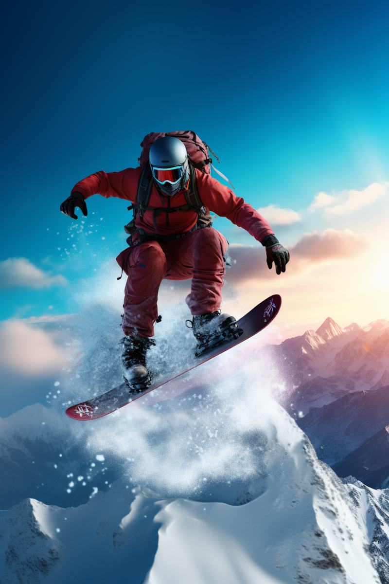
Northfall is a premium snowboarding company born in the mountains and built for riders who value progression, craftsmanship, and respect for the terrain. As the brand prepared to move from small-batch boards to national retail and direct-to-consumer sales, they partnered with Climb to define a bold identity that could stand up in shops, on slopes, and online.
The Problem
Northfall had a strong product and loyal early following, but their brand didn’t reflect the quality or philosophy behind their boards. Years of organic growth had resulted in an inconsistent visual identity and unclear positioning.
Key challenges included:
- A logo and visual system that felt dated and generic
- No clear differentiation from mass-market snowboard brands
- Inconsistent application across boards, packaging, and apparel
- Difficulty attracting retail partners due to lack of brand clarity
Northfall needed a brand that communicated credibility, grit, and purpose—without leaning into clichés or extreme aesthetics that could limit long-term growth.
The Solution
Climb worked with Northfall to build a brand rooted in restraint, confidence, and mountain heritage—designed to feel timeless rather than trendy.
Brand Strategy & Identity
The new identity was inspired by elevation lines, winter light, and the quiet intensity of backcountry riding. Climb delivered:
- A bold, minimal wordmark designed for board tops, bindings, and apparel
- A flexible logo system that scaled from small hardware marks to retail signage
- A muted, high-contrast color palette built for snow environments
- A rugged yet refined typographic system emphasizing strength and clarity
The brand voice was sharpened to speak directly to committed riders—focusing on progression, trust, and the relationship between rider and terrain.
Project Timeline
- Week 1–2: Brand discovery, rider interviews, and competitive analysis
- Week 3–4: Identity exploration and visual system development
- Week 5: Board graphics, packaging, and apparel applications
- Week 6: Brand guidelines and launch asset delivery
Total timeline: 6 weeks from kickoff to final brand system
The Outcome
The rebrand positioned Northfall as a credible premium option in a crowded snowboarding market and unlocked new growth opportunities.
Results within the first season:
- 3× increase in wholesale inquiries
- +54% growth in direct-to-consumer sales
- Secured placement in 12 new retail locations
- Sold out flagship board model two months ahead of forecast
- Improved brand consistency across all product lines and marketing channels
Most importantly, the new identity gave Northfall a platform they could grow into—supporting future product lines, collaborations, and global expansion.
Closing
By grounding the brand in authenticity and restraint, Climb helped Northfall stand out without shouting—proving that strong branding doesn’t have to be loud to be powerful.